Imposer la couleur du texte prérempli dans un formulaire
Bonjour,
Je souhaiterais imposer la couleur du texte que je fais apparaître par défaut dans un formulaire surtout pour des listes déroulantes.
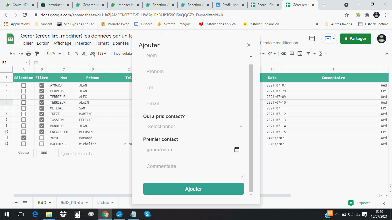
Dans le formulaire ci-dessous, je voudrais que "Langue", "Type de contact" et "Qui a pris contact?" apparaissent aussi en gris.

Sauriez-vous m'aider?
Edit
Bonjour,
Peux-tu envoyer ton code.
Le problème est en effet sur les listes déroulantes, et je n'ai pas de solution, donc je suis intéressé aussi !
Quand on a un placeholder, on peut jouer avec les css
<input type="text" name="nom" value="" placeholder="Nom"> input:focus::placeholder, textarea:focus::placeholder {
color: #f3f3f3;
}quand on a une liste déroulante, ce n'est pas pareil !
<option value="" disabled selected >Selectionner ...</option>Bonjour,
Peux-tu envoyer ton code.
le code est le même que celui-ci
    <style>
      body {
        padding: 0 0.5rem; /* à remplacer par "margin: 0;" si affiché dans une boîte de dialogue */
        color: #333;
        font-family: Roboto, Arial, sans-serif;
      }
      textarea {
        font-family: Roboto, Arial, sans-serif;
      }
      p {
        margin: 0.8rem 0 0.3rem;
      }
      input[type="date"],input[type="text"] {
        font-family: Roboto, Arial, sans-serif;
        display: block;
        width: 100%;
        box-sizing: border-box;
        margin-bottom: 1rem;
        padding: 0.6rem 0.7rem;
        background: #f3f3f3;
        color: #aaa;
        border: none;
        font-size: 1.08rem;
        border-radius: 0.4rem;
      }
      input[type="button"] {
        display: block;
        width: 100%;
        padding: 0.7rem 0 0.6rem;
        border: none;
        background: #30a392;
        color: #fff;
        font-size: 1.15rem;
        cursor: pointer;
        border-radius: 0.4rem;
      }
      input[type="button"]:hover {
        background: #40ad96;
      }
      input::placeholder, textarea::placeholder {
        color: #aaa;
      }
      input:focus::placeholder, textarea:focus::placeholder {
        color: #aaa;
      }
      select,textarea {
        display: block;
        width: 100%;
        box-sizing: border-box;
        margin-bottom: 1rem;
        padding: 0.6rem 0.7rem;
        background: #f3f3f3;
        color: #aaa;
        border: none;
        font-size: 1.08rem;
        border-radius: 0.4rem;
      }
      select option:disabled {
        color: #aaa;
      }
      select option {
        color: #aaa;
      }
    </style>
Les textes sont tous en #aaa
Image du rendu:

Pour la liste déroulante:
select {
        display: block;
        width: 100%;
        box-sizing: border-box;
        margin-bottom: 1rem;
        padding: 0.6rem 0.7rem;
        background: #f3f3f3;
        color: #aaa;
        border: none;
        font-size: 1.08rem;
        border-radius: 0.4rem;
}
select option:disabled {
        color: #aaa;
}
select option {
        color: #aaa;
}
Bonne Journée
@ImoKa,
je pense que le but (pour en avoir discuté avec Patrick), c'est d'avoir Selectionner (disabled selected) en #aaa comme s'il s'agissait d'un placeholder

et les options en #444, donc une fois sélectionnée cela reste comme ceci

    <style>
      body {
        padding: 0 0.5rem; /* à remplacer par "margin: 0;" si affiché dans une boîte de dialogue */
        color: #333;
        font-family: Roboto, Arial, sans-serif;
      }
      textarea {
        font-family: Roboto, Arial, sans-serif;
      }
      p {
        margin: 0.8rem 0 0.3rem;
      }
      input[type="date"],input[type="text"] {
        font-family: Roboto, Arial, sans-serif;
        display: block;
        width: 100%;
        box-sizing: border-box;
        margin-bottom: 1rem;
        padding: 0.6rem 0.7rem;
        background: #f3f3f3;
        color: #444;
        border: none;
        font-size: 1.08rem;
        border-radius: 0.4rem;
      }
      input[type="button"] {
        display: block;
        width: 100%;
        padding: 0.7rem 0 0.6rem;
        border: none;
        background: #30a392;
        color: #fff;
        font-size: 1.15rem;
        cursor: pointer;
        border-radius: 0.4rem;
      }
      input[type="button"]:hover {
        background: #40ad96;
      }
      input::placeholder, textarea::placeholder {
        color: #aaa;
      }
      input:focus::placeholder, textarea:focus::placeholder {
        color: #aaa;
      }
      select,textarea {
        display: block;
        width: 100%;
        box-sizing: border-box;
        margin-bottom: 1rem;
        padding: 0.6rem 0.7rem;
        background: #f3f3f3;
        color: #444;
        border: none;
        font-size: 1.08rem;
        border-radius: 0.4rem;
      }
      select option:disabled {
        color: #aaa;
      }
      select option {
        color: #444;
      }
</style>merci ImoKa, c'est incroyable, j'ai recopié intégralement ton css et cela ne fonctionne pas chez moi, je suis pourtant sous chrome aussi ... on va voir si pour Patrick c'est ok

indicatif, sélectionner et jj/mm/aaaa sont toujours en #444 et non en #aaa
Bizzare...
J'avais copier-coller mon css intermédiaire et envoyer la capture du résultat avec le suivant.
    <style>
      body {
        padding: 0 0.5rem; /* à remplacer par "margin: 0;" si affiché dans une boîte de dialogue */
        color: #333;
        font-family: Roboto, Arial, sans-serif;
      }
      textarea {
        font-family: Roboto, Arial, sans-serif;
      }
      p {
        margin: 0.8rem 0 0.3rem;
      }
      input[type="text"] {
        font-family: Roboto, Arial, sans-serif;
        display: block;
        width: 100%;
        box-sizing: border-box;
        margin-bottom: 1rem;
        padding: 0.6rem 0.7rem;
        background: #f3f3f3;
        color: #444;
        border: none;
        font-size: 1.08rem;
        border-radius: 0.4rem;
      }
      input[type="date"] {
        font-family: Roboto, Arial, sans-serif;
        display: block;
        width: 100%;
        box-sizing: border-box;
        margin-bottom: 1rem;
        padding: 0.6rem 0.7rem;
        background: #f3f3f3;
        color: #aaa;
        border: none;
        font-size: 1.08rem;
        border-radius: 0.4rem;
      }
      input[type="button"] {
        display: block;
        width: 100%;
        padding: 0.7rem 0 0.6rem;
        border: none;
        background: #30a392;
        color: #fff;
        font-size: 1.15rem;
        cursor: pointer;
        border-radius: 0.4rem;
      }
      input[type="button"]:hover {
        background: #40ad96;
      }
      input::placeholder, textarea::placeholder {
        color: #aaa;
      }
      input:focus::placeholder, textarea:focus::placeholder {
        color: #aaa;
      }
      select,textarea {
        display: block;
        width: 100%;
        box-sizing: border-box;
        margin-bottom: 1rem;
        padding: 0.6rem 0.7rem;
        background: #f3f3f3;
        color: #aaa;
        border: none;
        font-size: 1.08rem;
        border-radius: 0.4rem;
      }
      select option::disabled {
        color: #aaa;
      }
      select option {
        color: #444;
      }
</style>Bonsoir,
C'est presque ça.
Les textes par défaut sont bien grisés à l'ouverture du formulaire mais lorsque le choix est fait, ils restent grisés alors qu'il faudrait qu'ils soient noirs pour qu'on comprenne bien que le choix a été fait.

Essaie ça
    <style>
      body {
        padding: 0 0.5rem; /* à remplacer par "margin: 0;" si affiché dans une boîte de dialogue */
        color: #333;
        font-family: Roboto, Arial, sans-serif;
      }
      textarea {
        font-family: Roboto, Arial, sans-serif;
      }
      p {
        margin: 0.8rem 0 0.3rem;
      }
      input[type="text"] {
        font-family: Roboto, Arial, sans-serif;
        display: block;
        width: 100%;
        box-sizing: border-box;
        margin-bottom: 1rem;
        padding: 0.6rem 0.7rem;
        background: #f3f3f3;
        color: #444;
        border: none;
        font-size: 1.08rem;
        border-radius: 0.4rem;
      }
      input[type="date"] {
        font-family: Roboto, Arial, sans-serif;
        display: block;
        width: 100%;
        box-sizing: border-box;
        margin-bottom: 1rem;
        padding: 0.6rem 0.7rem;
        background: #f3f3f3;
        color: black;
        border: none;
        font-size: 1.08rem;
        border-radius: 0.4rem;
      }
      input[type="button"] {
        display: block;
        width: 100%;
        padding: 0.7rem 0 0.6rem;
        border: none;
        background: #30a392;
        color: #fff;
        font-size: 1.15rem;
        cursor: pointer;
        border-radius: 0.4rem;
      }
      input[type="button"]:hover {
        background: #40ad96;
      }
      input::placeholder, textarea::placeholder {
        color: #aaa;
      }
      input:focus::placeholder, textarea:focus::placeholder {
        color: #aaa;
      }
      select,textarea {
        display: block;
        width: 100%;
        box-sizing: border-box;
        margin-bottom: 1rem;
        padding: 0.6rem 0.7rem;
        background: #f3f3f3;
        color: black;
        border: none;
        font-size: 1.08rem;
        border-radius: 0.4rem;
      }
      select option::disabled {
        color: #aaa;
      }
      select option {
        color: #444;
      }
</style>Malheureusement, le nouveau script que tu proposes revient à la solution initiale. Les textes par défaut sont noirs.

select option::disabled {
        color: #aaa;
      }
Je pensais que cette partie correspondrait au texte affiché par défaut dans la liste déroulante mais ce n'est pas vrai.
Les changements n'ont aucun impact sur la couleur du texte par défaut. La question est de savoir comment s'appelle le paramètre du texte par défaut.
Pour que le les textes par défaut soivent gris, il faut que toutes la liste soit gris.
J'ai le même soucis que Patrick,
donc il n'y a pas de solution pour que la ligne disabled par défaut soit gris clair (#aaa) et que le choix fait soit gris foncé (#444) comme pour un input et le placeholder
Il faudrait mettre un placehorder.
Bonne suggestion ... tu nous montres la syntaxe d'un placeholder sur un select option (car je n'ai pas trouvé et je doutais jusqu'à maintenant que cela pouvait exister) ?
C'est bon sa marche, un petit script et un peu de css.
<html>
    <head>
        <script>

            function changeColor(s) {
                if(s.options[s.selectedIndex].value == "") {
                    s.style.color = "#444";
                } else {
                    s.style.color = "black";
                }
            }
        </script>
        <style>
        .placeholder{
         display: block;
     box-sizing: border-box;
     margin-bottom: 1rem;
     border: none;
     font-size: 1.08rem;
     border-radius: 0.4rem;
         background: #f3f3f3;
         color: #a9a9a9;
          width: 100%;
          height: 25px;
        }
        option:first-child{color:black; display: none;}
        option {color:black;}
        </style>
    </head>
    <body>
            <select id="choix" class="placeholder" onchange="changeColor(this);">
                <option value="" disabled selected hidden>Type de contact</option>
              <option value="email">Email</option>
                <option value="tel">Tel</option>
                <option value="courrier">Courrier</option>
                <option value="forum">Forum</option>
                <option value="ami">Ami</option>
            </select>
    </body>
</html>
Voilà !!!!!!!!!!!!!!!!!!!!!!!
https://jsfiddle.net/0go81utr/6/
padding faisait bugé, alors je l'ai pas mis.
css.html
    <style>
      body {
        padding: 0 0.5rem; /* à remplacer par "margin: 0;" si affiché dans une boîte de dialogue */
        color: #333;
        font-family: Roboto, Arial, sans-serif;
      }
      textarea {
        font-family: Roboto, Arial, sans-serif;
      }
      p {
        margin: 0.8rem 0 0.3rem;
      }
      input[type="text"] {
        font-family: Roboto, Arial, sans-serif;
        display: block;
        width: 100%;
        box-sizing: border-box;
        margin-bottom: 1rem;
        padding: 0.6rem 0.7rem;
        background: #f3f3f3;
        color: #444;
        border: none;
        font-size: 1.08rem;
        border-radius: 0.4rem;
      }
      input[type="date"] {
        font-family: Roboto, Arial, sans-serif;
        display: block;
        width: 100%;
        box-sizing: border-box;
        margin-bottom: 1rem;
        padding: 0.6rem 0.7rem;
        background: #f3f3f3;
        color: black;
        border: none;
        font-size: 1.08rem;
        border-radius: 0.4rem;
      }
      input[type="button"] {
        display: block;
        width: 100%;
        padding: 0.7rem 0 0.6rem;
        border: none;
        background: #30a392;
        color: #fff;
        font-size: 1.15rem;
        cursor: pointer;
        border-radius: 0.4rem;
      }
      input[type="button"]:hover {
        background: #40ad96;
      }
      input::placeholder, textarea::placeholder {
        color: #aaa;
      }
      input:focus::placeholder, textarea:focus::placeholder {
        color: #aaa;
      }
      textarea {
        display: block;
        width: 100%;
        box-sizing: border-box;
        margin-bottom: 1rem;
        padding: 0.6rem 0.7rem;
        background: #f3f3f3;
        color: black;
        border: none;
        font-size: 1.08rem;
        border-radius: 0.4rem;
      }
      .placeholder{
    display: block;
        box-sizing: border-box;
        margin-bottom: 1rem;
        border: none;
        font-size: 1.08rem;
        border-radius: 0.4rem;
    background: #f3f3f3;
    color: #a9a9a9;
     width: 100%;
     height: 25px;
       }
       option:first-child{color:black; display: none;}
       option {color:black;}
    </style>